New Rule New Experience
Added new feature in netflix world - Cast
When I write about UI design and UX architecture, I’m usually centered around the concept that an ideal digital experience mimics a ubiquitous one from physical reality. In some cases, this is true even if the physical experience stems from an expired cultural phenomenon. Our shared experiences linger in our minds, and that can serve as an untapped energy source for powering a digital UX.
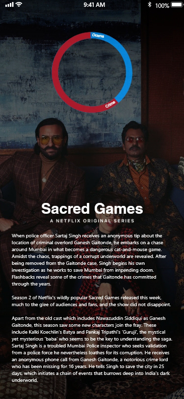
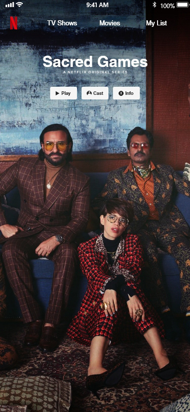
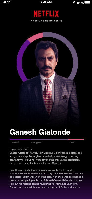
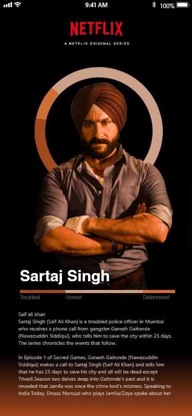
I wanted to get an idea of how to design the visual hierarchy, so i tested out different type of layouts with our target group. Using eye tracking and letting the users speak out loud, i managed to get a good idea of the visual hierarchy early in the process.
So, how would Netflix look like if it was driven by algorithms based on parameters such as movement and experience. When reading the UX and UI trends that is getting more recognition in 2019. I’m convinced that services like Netflix, Spotify and other streaming services will head towards a more and more user experience-friendly interface, which is much more personalised.
